A Simple Package to Simplify Screen Management for Flutter
Introduction
Have you ever found yourself in the situation of doing some async processing your screen and wanting to prevent the user from interacting with the screen while the application is loading? If so, this package was made just for you.
Basic Usage
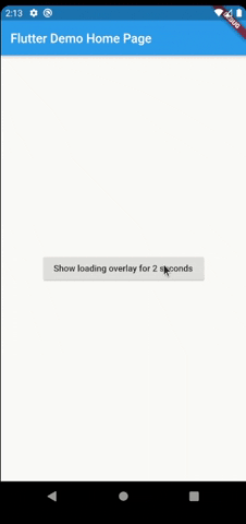
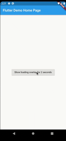
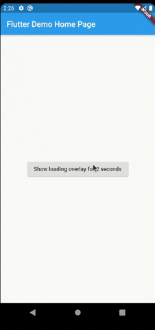
The most simple usage is just wrap the widget that you want an overlay on LoaderOverlay. Default loader will be shown.
class MyApp extends StatelessWidget {
  @override
  Widget build(BuildContext context) {
    return MaterialApp(
      title: 'Flutter Demo',
      theme: ThemeData(
        primarySwatch: Colors.blue,
      ),
      home: LoaderOverlay(
        child: MyHomePage(title: 'Flutter Demo Home Page'),
      ),
    );
  }
}
This simple step will already configure the loader overlay for use.
After that configuration you can just run the command:
context.loaderOverlay.show()
This will show the overlay with the default loading indicator. The default loading configured is to just show a centered CircularProgressIndicator
To hide the overlay (after the async processing, for example), just run the command:
context.loaderOverlay.hide()
You can check if overlay is visible:
final isVisible = context.loaderOverlay.visible
And get the type of overlay widget:
final type = context.loaderOverlay.overlayWidgetType
*Note: You will always need the context to show or hide the loader overlay
Basic Usage on Named Routes
To use this package with named routes you can just wrap your MaterialApp with GlobalLoaderOverlay. This widget has all the features of LoaderOverlay but it is provided for all the routes of the app.
@override
Widget build(BuildContext context) {
return GlobalLoaderOverlay(
  child: MaterialApp(
    debugShowCheckedModeBanner: false,
    title: 'Flutter Demo',
    theme: ThemeData(primarySwatch: Colors.teal, fontFamily: 'Baloo'),
    initialRoute: '/',
    routes: {
      '/': (context) => Page1(),
      '/page2': (context) => Page2(),
    },
  ),
);
}
Customization
Your overlay loader widget can be any widget you want. For example you can import the package flutter_spinkit and customise your widget like this. To do that just pass your widget to overlayWidget and set useDefaultLoading to false.
class MyApp extends StatelessWidget {
  @override
  Widget build(BuildContext context) {
    return MaterialApp(
      title: 'Flutter Demo',
      theme: ThemeData(
        primarySwatch: Colors.blue,
      ),
      home: LoaderOverlay(
        useDefaultLoading: false,
        overlayWidget: Center(
          child: SpinKitCubeGrid(
            color: Colors.red,
            size: 50.0,
          ),
        ),
        child: MyHomePage(title: 'Flutter Demo Home Page'),
      ),
    );
  }
}
Another customisation you can do is configure the opacity of the overlay. The default opacity is 0.4, but you can pass your own opacity by setting the overlayOpacity property.
class MyApp extends StatelessWidget {
  @override
  Widget build(BuildContext context) {
    return MaterialApp(
      title: 'Flutter Demo',
      theme: ThemeData(
        primarySwatch: Colors.blue,
      ),
      home: LoaderOverlay(
        useDefaultLoading: false,
        overlayWidget: Center(
          child: SpinKitCubeGrid(
            color: Colors.red,
            size: 50.0,
          ),
        ),
        overlayOpacity: 0.8,
        child: MyHomePage(title: 'Flutter Demo Home Page'),
      ),
    );
  }
}
This is a much opaque overlay:
You may want to have several different loaders in your app. In this case just pass any widget to the loaderOverlay.show:
class ReconnectingOverlay extends StatelessWidget {
  @override
  Widget build(BuildContext context) => Center(
        child: Column(
          mainAxisSize: MainAxisSize.min,
          children: [
            Padding(
              padding: const EdgeInsets.symmetric(horizontal: 20.0),
              child: CircularProgressIndicator(),
            ),
            SizedBox(height: 12),
            Text(
              'Reconnecting...',
            ),
          ],
        ),
      );
}

context.loaderOverlay.show(
  widget: ReconnectingOverlay()
),
And then you can check the type before hide it:
if (context.loaderOverlay.visible && context.loaderOverlay.overlayWidgetType == ReconnectingOverlay) {
  context.loaderOverlay.hide();
}
If you pass widget to context.loaderOverlay.show, then defaultLoader and widgetOverlay will be ignored;
Animation
By default, the overlay does not animate in or out. You can enable animations by passing the appropriate parameters to LoaderOverlay. Internally, an AnimatedSwitcher is used to manage animations, so the parameters are passed directly to the AnimatedSwitcher. By specifying a duration and reverseDuration, the overlay will animate in and out using a fade (the default transition used by AnimatedSwitcher). You can also pass curves, a transition builder and a layout builder for further customisation.
class MyApp extends StatelessWidget {
  @override
  Widget build(BuildContext context) {
    return MaterialApp(
      title: 'Flutter Demo',
      theme: ThemeData(
        primarySwatch: Colors.blue,
      ),
      home: LoaderOverlay(
        duration: const Duration(milliseconds: 250),
        reverseDuration: const Duration(milliseconds: 250),
        // switchInCurve,
        // switchOutCurve,
        // transitionBuilder,
        // layoutBuilder,
        child: MyHomePage(title: 'Flutter Demo Home Page'),
      ),
    );
  }
}
Todo
- Tests
Suggestions & Bugs
For any suggestions or bug report please head to issue tracker.
Use this package as a library
Depend on it
Run this command:
With Flutter:
$ flutter pub add loader_overlayThis will add a line like this to your package's pubspec.yaml (and run an implicit flutter pub get):
dependencies:
  loader_overlay: ^2.3.0
Alternatively, your editor might support flutter pub get. Check the docs for your editor to learn more.
Import it
Now in your Dart code, you can use:
import 'package:loader_overlay/loader_overlay.dart';import 'package:flutter/material.dart';
import 'package:flutter_spinkit/flutter_spinkit.dart';
import 'package:loader_overlay/loader_overlay.dart';
void main() => runApp(MyAppGlobalLoaderOverlay());
class MyApp extends StatelessWidget {
@override
Widget build(BuildContext context) {
return MaterialApp(
title: 'Flutter Demo',
theme: ThemeData(
primarySwatch: Colors.blue,
),
home: LoaderOverlay(
useDefaultLoading: false,
overlayWidget: Center(
child: SpinKitCubeGrid(
color: Colors.red,
size: 50.0,
),
),
overlayColor: Colors.black,
overlayOpacity: 0.8,
child: MyHomePage(),
),
);
}
}
class MyAppGlobalLoaderOverlay extends StatelessWidget {
@override
Widget build(BuildContext context) {
return GlobalLoaderOverlay(
child: MaterialApp(
debugShowCheckedModeBanner: false,
title: 'Flutter Demo',
theme: ThemeData(
primaryColor: Colors.black,
fontFamily: 'Baloo',
),
initialRoute: '/',
routes: {
'/': (context) => MyHomePage(),
},
),
useDefaultLoading: false,
overlayWidget: Center(
child: SpinKitCubeGrid(
color: Colors.red,
size: 50.0,
),
),
overlayColor: Colors.black,
overlayOpacity: 0.8,
duration: Duration(seconds: 2),
);
}
}
class MyHomePage extends StatefulWidget {
MyHomePage({Key? key}) : super(key: key);
@override
_MyHomePageState createState() => _MyHomePageState();
}
class _MyHomePageState extends State<MyHomePage> {
bool _isLoaderVisible = false;
@override
Widget build(BuildContext context) {
return Scaffold(
body: Center(
child: Column(
mainAxisAlignment: MainAxisAlignment.center,
children: <Widget>[
ElevatedButton(
onPressed: () async {
context.loaderOverlay.show();
setState(() {
_isLoaderVisible = context.loaderOverlay.visible;
});
await Future.delayed(Duration(seconds: 2));
if (_isLoaderVisible) {
context.loaderOverlay.hide();
}
setState(() {
_isLoaderVisible = context.loaderOverlay.visible;
});
},
child: Text('Show loader overlay for 2 seconds'),
),
ElevatedButton(
onPressed: () async {
context.loaderOverlay.show(widget: ReconnectingOverlay());
setState(() {
_isLoaderVisible = context.loaderOverlay.visible;
});
await Future.delayed(Duration(seconds: 3));
if (_isLoaderVisible &&
context.loaderOverlay.overlayWidgetType ==
ReconnectingOverlay) {
context.loaderOverlay.hide();
}
setState(() {
_isLoaderVisible = context.loaderOverlay.visible;
});
},
child: Text('Show custom loader overlay for 2 seconds'),
),
Text('Is loader visible: $_isLoaderVisible'),
],
),
),
);
}
}
class ReconnectingOverlay extends StatelessWidget {
@override
Widget build(BuildContext context) => Center(
child: Column(
mainAxisSize: MainAxisSize.min,
children: [
CircularProgressIndicator(),
SizedBox(height: 12),
Text(
'Reconnecting...',
),
],
),
);
}
class PartScreenOverlay extends StatelessWidget {
@override
Widget build(BuildContext context) {
return MaterialApp(
title: 'Flutter Demo',
theme: ThemeData(
primarySwatch: Colors.blue,
),
home: LoaderOverlay(
useDefaultLoading: false,
overlayWidget: Center(
child: SpinKitCubeGrid(
color: Colors.red,
size: 50.0,
),
),
overlayOpacity: 0.8,
overlayWholeScreen: false,
overlayHeight: 100,
overlayWidth: 100,
child: Scaffold(
body: Center(
child: ElevatedButton(
child: Text('aaaaa'),
onPressed: () {
context.loaderOverlay.show();
},
),
),
),
),
);
}
}Download details:
Author: rodrigobastos.dev
Source: https://github.com/rodrigobastosv/loading_overlay
#flutter #android #ios #web-development #loading #loader #widget